PitchMojo is an android app for enabling entrepreneurs to create, edit and share their pitch.
Pitch Perfection on the go
PitchMojo
Android Application
Project Overview
Anyone who has ever had an idea knows how important it is to have a pitch that will impress and interest. Currently, there is no structured way to tailor your pitch as you get inspirations to make it better. The goal of PitchMojo is to provide entrepreneurs a neat way to perfect their pitches on the go.
My Role
I worked with the founder Madhan and the app developer Hassan to design the user experience and interface for the app. I was also responsible for the branding and visual design of the app icon and the product landing page.
Every entrepreneur who has ever had an idea knows how important the first 30 sec of pitching your idea to someone is.
This some one could be your potential investor, co-founder, developer or designer who will need to get interested in your idea enough to listen more and help you create the best solution/product from your idea or to consider investing in your idea.
Ultimately, this elevator pitch could make or break ideas.
Entrepreneurs who understand this, constantly strive to perfect their elevator pitch. Just like ideas happen anywhere, these sparks of inspiration to perfect the pitch happens anywhere and anytime. They get captured on the back paper napkins, post-its, a note in your notes app, email to self, etc.. Sadly, more often than not, these get lost and forgotten.
Single location to create, edit and share their pitch which is accessible anywhere and anytime.
PitchMojo solves this problem by providing an android mobile app with an interface designed to make the process of creating and editing your pitches easy. It provides a structure to help you shape your pitch in the right way. It provides you tips to keep your pitch on track. It enables you to email and export your pitches.
New Beginnings
Madhan had already been remotely working with an API developer from India and Hassan, android developer based in Pakisthan and had a prototype with the basic functionality for the first release. But, until then the focus had only been on the functionality.
Based on the work I did on the Jott.ly project, He approched me to design the user experience and visual design for the app. My challenge was to work with the existing api functionality and provide a good user experience.
Discover & Define through User Research
My focus was providing a delightful interface suitable for use on go. So, I did some initial research on the target users, the apps they use and how they use it. My research was part online and part offline. I spoke with some startup folks from India and Australia to understand their needs and how they approach their startup pitch creation.
Based on my research, we were able to validate the concept and also identify key user stories to aid me in designing the interface. We got on skype often to discuss my findings and also to better understand the functionalities and limitations of the api which was already in the works. With a good understanding of the user needs, I prioritised the functionalities and created user flows for the app.
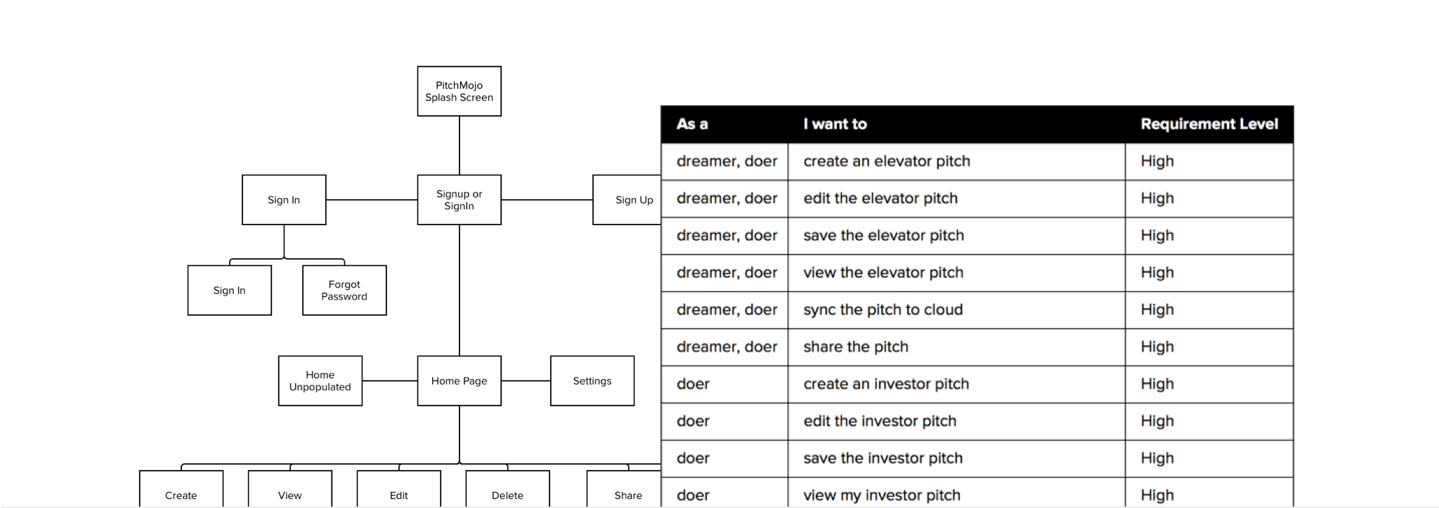
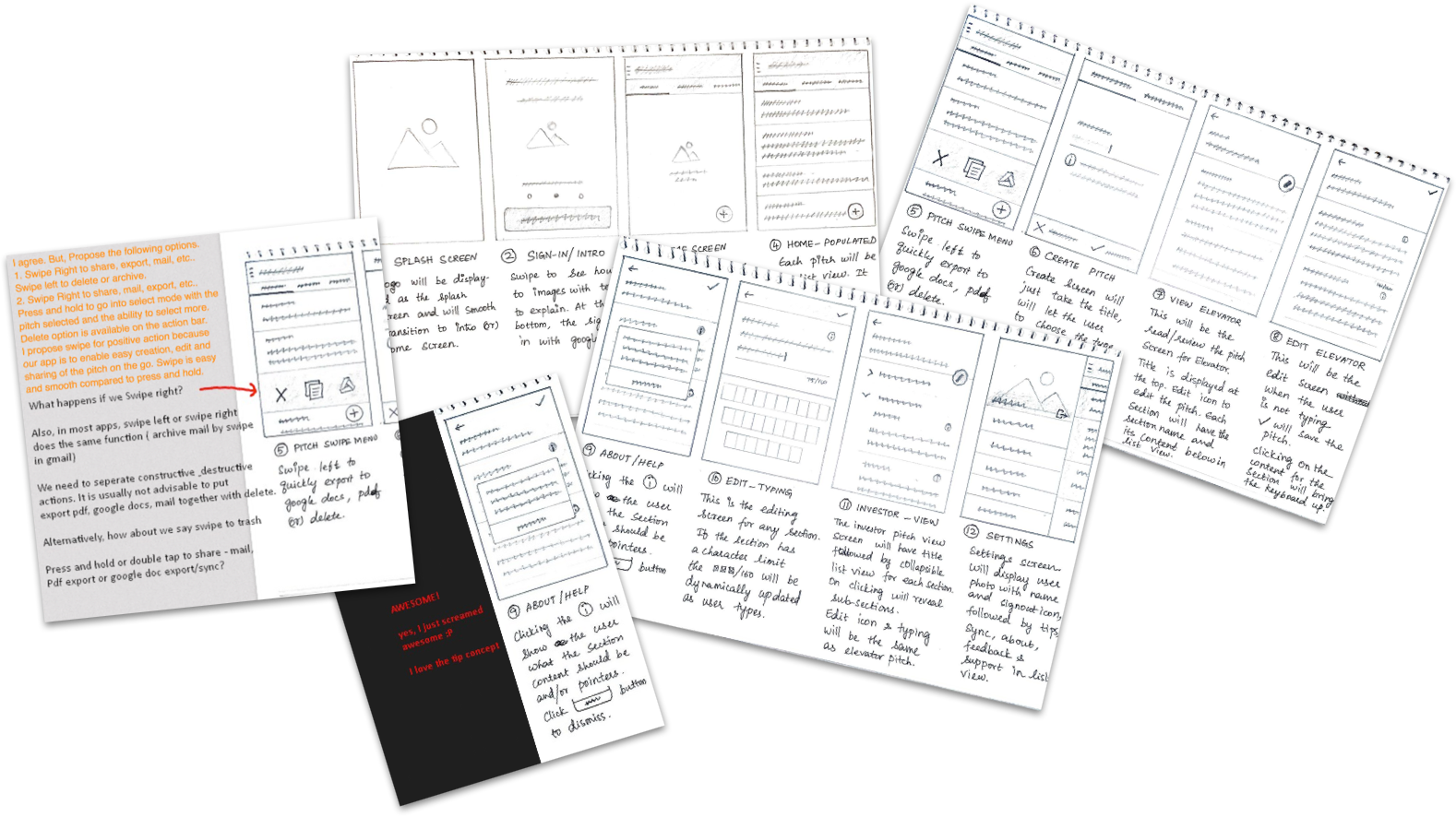
Sketching & Wireframing
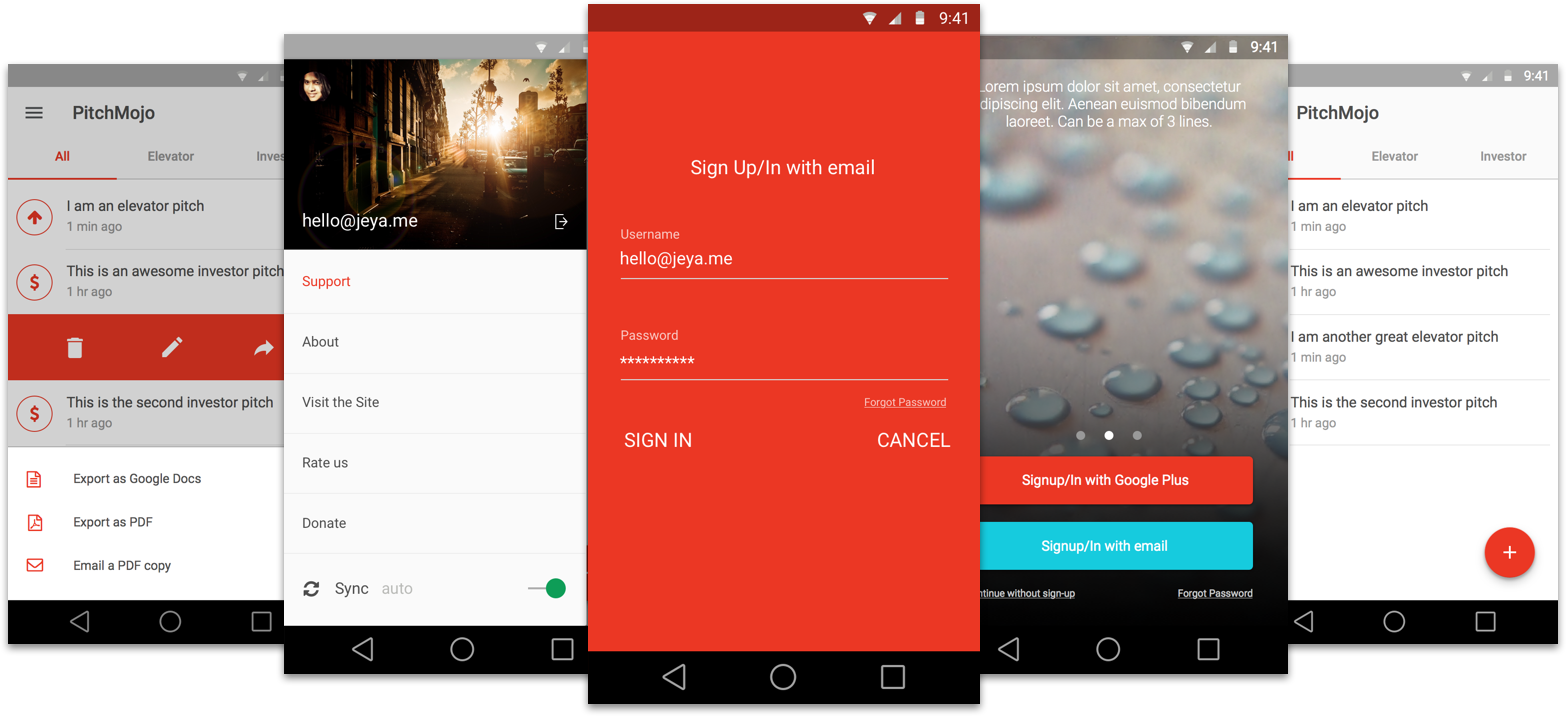
I did some initial sketching on paper with pencil and sharpies. After some review and iteration, used Axure to create detailled wireframes. The key here was to design, review and iterate until we had a smooth user experience. Google’s Material design was used as the guideline to create a slick, modern UI.
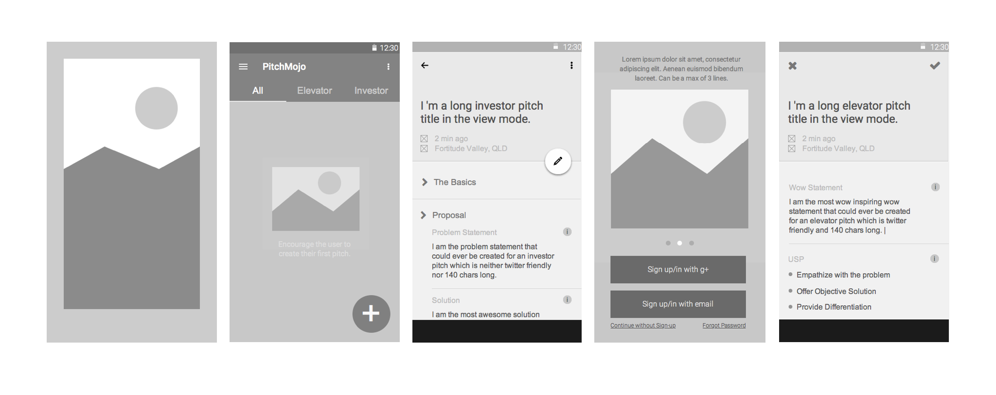
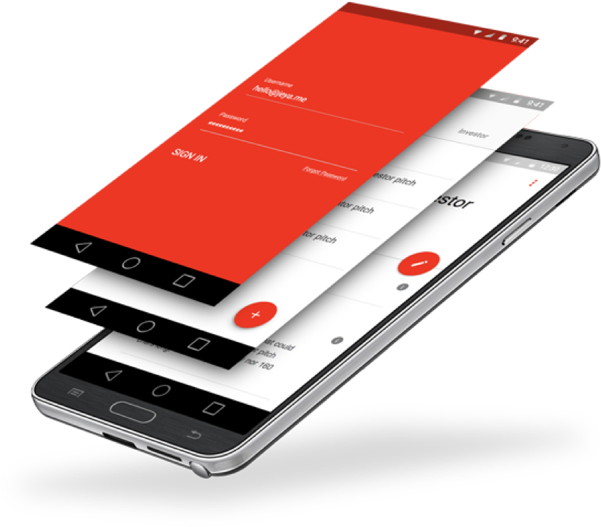
Visual Design
I used the Bohemian Coding’s Sketch 3 to design the interface of the app. With symbols and text styles, it was easy to iterate the design and integrate user and client feedback. For user testing, I used invision to create and install the invision prototype and asked the selected users to perform specific tasks. From observation and their feedback, I re-iterated the design.
Branding
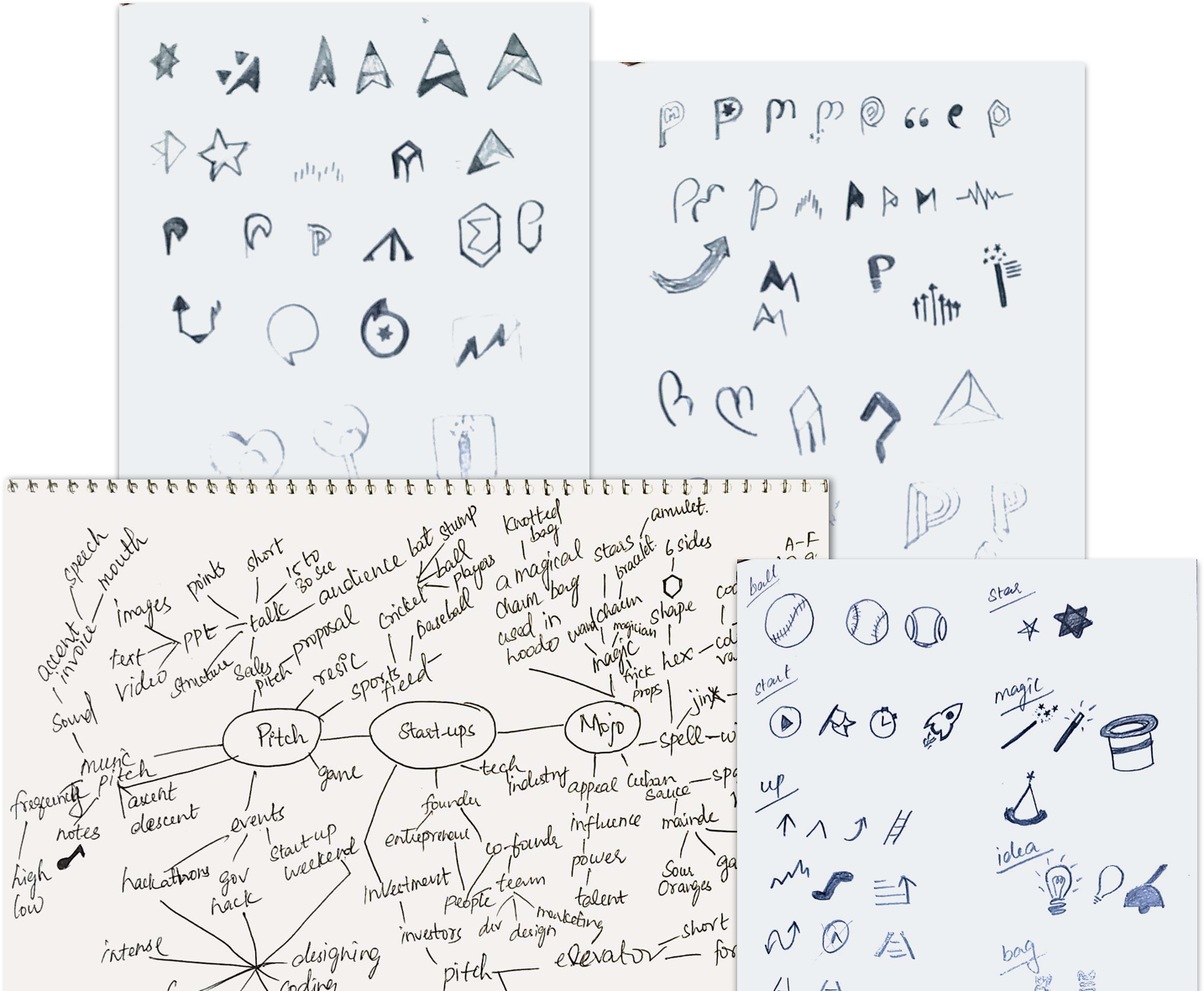
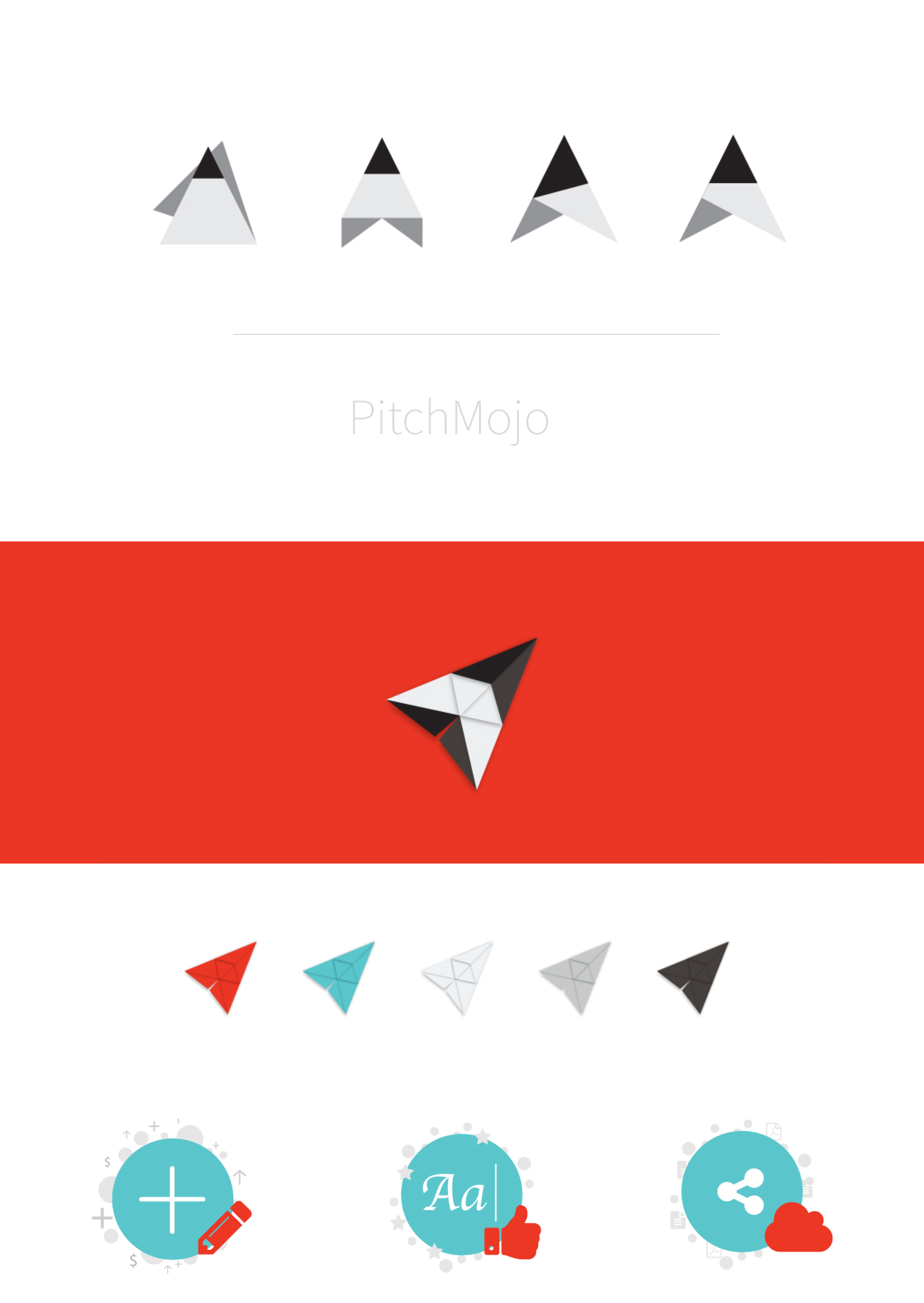
After extensive mind-mapping, sketching and refining, we finalised the app icon. The app icon combines the concept of folded paper napkin, pencil tip and paper plane.
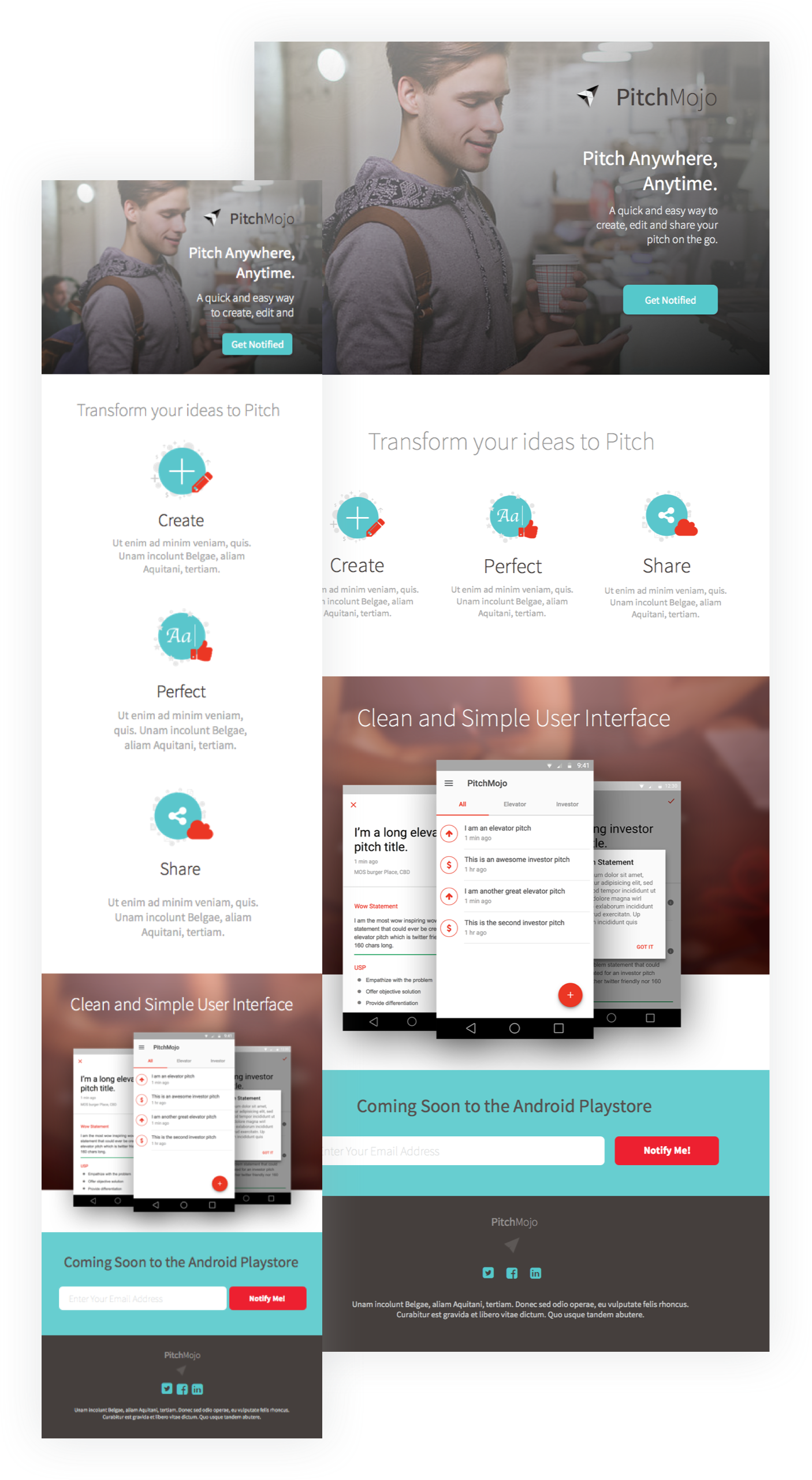
The app is currently under development. It will be coming soon to the android play store. Updates will follow.
Early Feedback
“There's lot more to "Design" than meets the eye. After collaborating with Jeya for the last couple of days, I must say, she maybe new but she knows her stuff! I am just amazed at the level of commitment and involvement she puts into the project she undertakes. Awesome!! Look forward to some kickass UI/UX designs people!” - Madhan, Founder
Like what you saw? View Other Case Studies